Why every design is set in JetBrains Mono
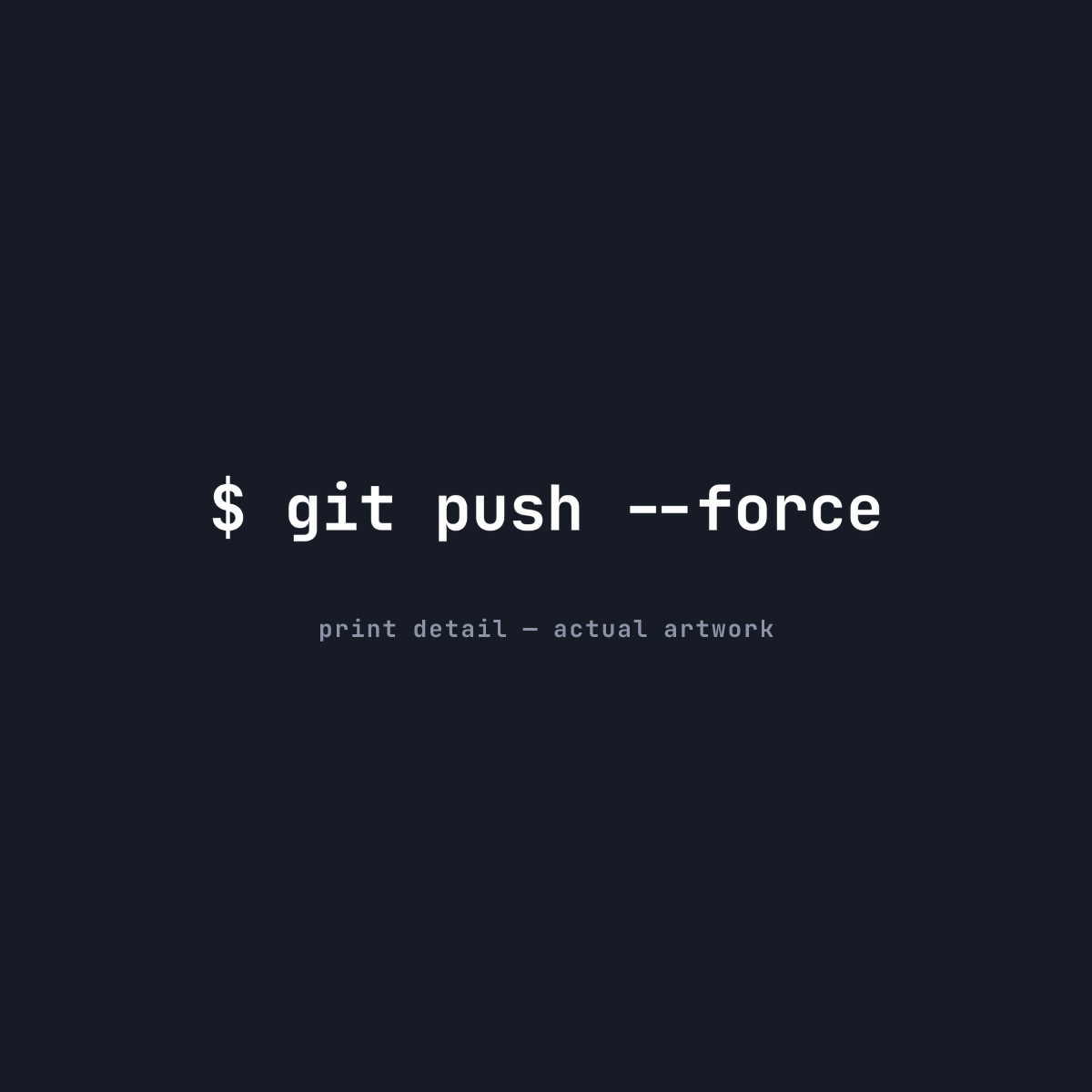
Most developer merch fails the same way: the joke is fine, but it’s typeset in whatever font the design tool defaulted to. A git push --force in Arial reads like a motivational poster. Nobody’s terminal looks like that.
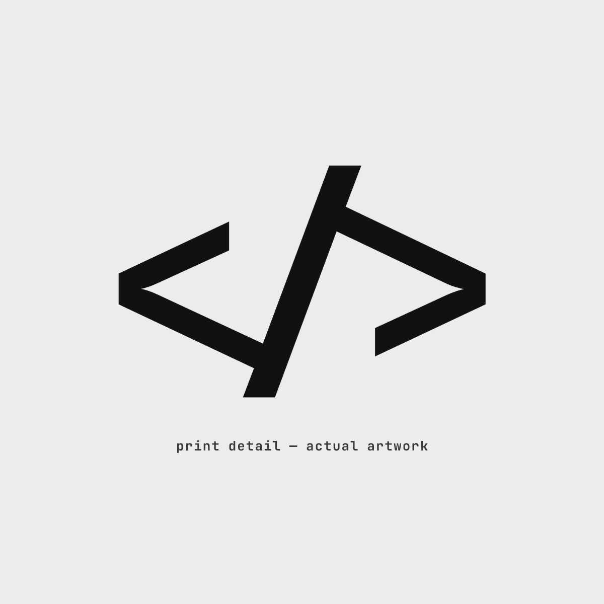
So we made a rule early on: everything gets set in JetBrains Mono — the actual font, under the SIL Open Font License, which explicitly allows merch use. If a design doesn’t survive being rendered in the same typeface you stare at for eight hours a day, it doesn’t get printed.
Why it matters
Monospace type carries context. A semicolon on a chest mark is just punctuation until you’ve spent forty minutes hunting a missing one. 127.0.0.1 is home only lands if your brain parses it as an IP address and not a random string of numbers — and the monospace setting is what triggers that parse for other developers.
It’s also a honesty check. If the text can’t hold up in a real code font — real ligature behavior, real spacing — it probably wasn’t a real joke either.
The rule, restated
- One typeface: JetBrains Mono.
- Two weights: 400 and 700, matching what’s actually in the font.
- No effects a terminal couldn’t produce.
That’s the whole brand system. Constraints make the designs easy to recognize — and hard to get wrong.